I AM A

We Make You Smile

design

Say Period to Period Poverty

design, greeting cards, colourI AM AComment

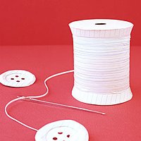
Period is a regular periodic occurrence in many women’s calendars.

As someone with long and heavy periods, the inconveniences and embarrassing moments a heavy period could bring, feminine hygiene products are a must-have (!) and not a nice-to-have luxury. We know how it feels.

We are long supporters and passionate about the campaign to stop period poverty by regularly donating sanitary products in our local supermarkets.

In a research conducted in 2018, one in ten young women in the UK have been unable to afford sanitary products. This could lead to serious consequences from girls not attending school in addition to inconveniences in day to day life. Not ovaryacting here, it’s important that feminine hygiene products are available across the board as essentials. Over 137,700 children in the UK have missed school as they were not able to afford feminine hygiene products to have access to do. This also means some girls ended up with their own make-shift DIY workarounds which may not be hygienic, let alone traumatic to have to go through it every month to think about solutions to resolve a monthly occurrence.

The idea where girls have to either stay at home due to the inconveniences with the unavailability of sanitary products, feeling awkward and embarrassed, to creating make shift options as alternatives are not acceptable.

We really want to be able to help say Period to Period Poverty. The organisations that have a good support network and outreach of the donation includes:

When we created our “In Few Words” collection of greeting cards. A collection of cards that contains 36 colour coded words including all the spectrum of colours in the colour palette from red to black. With each colour, we have complimentary coloured text. The concept of the greeting cards is to use as few words as possible on each card and express feelings straight to the point. For the colour way maroon, or oxblood we have included the word “Period”.

Period the word has multiple meanings, from meaning end of, the punctuation mark that is same as a full stop, and of course the physiology of the shedding of the uterus lining.

This card provides multiple conversation starters from end of an era, and moving onto new adventures, relationships, jobs to supporting a good cause to end period poverty.

Beyond International Women’s Day, for each card purchased, we are committed to donate 50p donation to help combat Period Poverty by contributing to the above mentioned charities. Let’s say PERIOD - to period poverty! Pick up you PERIOD card here and help spread the word to end period poverty!

Hungry for Mondrian Bento Box

yum, design, colourI AM AComment

We love bento boxes - a lunch box filled with normally the freshest combination of ingredients of the day to create the most scrummy meal. Normally it will include a combination of savoury dishes and a small dessert together within the lunch box.

Here, we are absolutely hungry for this bento box created by Yum Tang, a visual designer / food photographer in Beijing, China. As part of her collaboration with the IBM Thinkpad laptop, she has created a colour rich quirky and fun Mondrian colour Bento lunch box to be displayed onto the laptop.

The Mondrian bento box contains ingredients from that are vibrant in colours, from bright red watermelon, coral orange salmon to contrasting white noodles and rice along with some purple sweet potatoes all neatly lined up in a mondrian styled square and rectangle shaped cubicles within the lunch box.

Based on the shapes of the ingredients in the Bento box, we love how Yum has utilised the shapes and colours of the ingredients and translated them to digital prints.

We are so hungry for it both in colour and taste.

Behind the scene ink sketch preparation for creating Mondrian Bento Box
Animated gif for creating bento box
japanese bento box in Mondrian Style
Mondrian art print in photography vs in graphic design print format

Fashion In Paper Cut Style

paper, fun, designI AM AComment

With London Fashion Week in town, the new Christian Dior exhibition and the Great British sewing bee back on the telly box, plenty of fashion events happening around in London. This reminds us of a very beautifully made series of paper sculptures made by paper artist Matthew Sporzynski that is focussed on objects related to fashion, couture, handbag and shoes for magazine Real Simple. J’adore.

Afternoon Tea Set For Paper Lovers

paper, yum, design, colourI AM AComment

We love all things paper. Especially paper sculptures that are made into relatable fun items that brings back wonderful memories. Self taught Australian paper engineer Benja Harney of studio Paperform specialises in making everything (really everything!) fun and super cool with paper for their commercial clients. We LOVE how Benja will refer to people visiting his website as Paper Nerds! Yes, here!

This paper set of a classic afternoon tea set encapsulates all the favourite things we love about the British tradition of an afternoon tea. Those cucumber sandwiches, that perforated serviette, those fine paper bone china and cute delicious slices of pastel cakes… YUM!

fun afternoon tea paper sculptures

Super Cute Piggy Bags

designI AM AComment

It’s the Year of the Pig this year, and these cute pigs from Kate Spade totally melt our hearts. Our kind of piggy bags ( instead of piggy bags, pun intended ) in all shades of pink. Tickled pink!

5 Best Risograph Colour Charts

design, colourI AM AComment

We have long loved the effects of what risograph can achieve. The imperfections, the gradients, the opacity, the overlaps - love! We have used it for packaging design for our Stationery Gift Boxes for the belly bands and the box liners.

When printing with Risograph (or riso), one of the favourite things we love, apart from the process, the changing of drums (yup we have done it), making the masters, and the effects it can achieve; are the colour charts that each printer would produce.

These colour charts are useful pieces of information from the printers to show the riso colours they have in stock, and also serve as a guide for designers as a source of inspiration on how to set their gradients, line weights, font size etc. It is one of those pieces of paper that definitely tops a colour lover’s hoard list (yes us!), which Marie Kondo may not approve. Hey Marie, if you are reading, we do thank these Riso charts for their service, so, here we are keeping them in digital for now.

Here we have shared some of our favourite Riso colour charts. These colour charts to us are like a window of expression of personalities and styles of each of the print studios:

Popurri, Korea

This is a super fun animated risograph colour chart from Popurri, a risograph studio in Seoul, Korea. We love cute gifs. To make a colour chart with a combination of super quirky illustrations and animate it, this is totally rad! We particularly love the playful messages in the colour chart “I Need A Friend”, and “Draw His New Friend” - that makes our hearts melt, super adorbs.

Super fun animated risograph colour chart Popurri, Korea

InkChaCha, Hong Kong

This clear, precise and simple risograph colour chart shows brilliant examples on colours available by print studio InkChaCha in Hong Kong. This colour guide shows the different effects that can be achieved from riso printing, from swatch samples of matching colour gradients, overlapping different riso colour shades, to brush strokes effects. One of the most comprehensive and detailed colour charts we have come across that works great as a neat reference guide to Risograph printing. Yup, we have a copy of it in the studio and it is definitely one of the items on our hoard list which we will never be able to part with.

Inkchacha Hong Kong Risograph Colour Chart.jpg

Paper Pusher Printworks, Canada

Paper Pusher Printworks is a print studio in Toronto, Canada which is the brainchild of artist / designer J P King. They have produced a really cool and one of the most delicious Risograph chart that is as yum as looking at delicious Pâte de Fruits jelly cubes. This beautiful colour chart not only depicts the risograph colours that are available in the studio but also cleverly shows on the same axis how you can mix and match to create new colour shades, that are not offered as standard risograph shades by overprinting 2 or more colours.

P.S If you are veg lovers like us, note, the type examples in this colour chart is bursting with deliciousness.

Overlapping colours risograph printing colour chart Paper Pusher Printworks, Canada

Calverts CoOp, England

This risograph colour chart from printing cooperation Calverts CoOp in London is a colour chart for graphic design lovers. The colour chart in itself is a piece of brilliant graphic art that encompasses typography, shading, patterns, gradients. It also has a slant of Piet Mondrian in it, less cubism more graphical, with the red, blue, black and yellow colour scheme. Super cool! Apart from this overview colour chart, for each individual colours, they have taken the trouble to show each individual colour they have in stock along with the different effects that can be achieved by changing around the opacity which could be seen via this link.

Calverts Coop London Graphical Risograph Colour Chart

PauseBread Press, China

PauseBread is a riso studio in Shanghai, China. It is both a printing studio, as well as a publisher that publishes its own work and collaborations under the name Banana Fish Books. We love the example of the vibrant colour chart that they have on display on their risograph splash page in their website. It beautifully captures the title of the page “Beauty of Risograph” and something we can resonate with. It’s a lovely colour chart example where they have displayed the colour chart like a piano keyboard; accompanied by details to demonstrate the effects that can be achieved by risograph printing. From depicting the different opacity with the use of a manuscript; highlighting different qualities such as the granular texture that risograph can offer, along with cute graphic footnotes. A very well composed, and a very sweet colour chart - a true beaut and a lovely tune we want to tune into. (Pun intended).

Pausebread Risograph Colour Chart Banana Fish Studio Shanghai