graphic design

Hungry for Mondrian Bento Box
yum, design, colourCommentWe love bento boxes - a lunch box filled with normally the freshest combination of ingredients of the day to create the most scrummy meal. Normally it will include a combination of savoury dishes and a small dessert together within the lunch box.
Here, we are absolutely hungry for this bento box created by Yum Tang, a visual designer / food photographer in Beijing, China. As part of her collaboration with the IBM Thinkpad laptop, she has created a colour rich quirky and fun Mondrian colour Bento lunch box to be displayed onto the laptop.
The Mondrian bento box contains ingredients from that are vibrant in colours, from bright red watermelon, coral orange salmon to contrasting white noodles and rice along with some purple sweet potatoes all neatly lined up in a mondrian styled square and rectangle shaped cubicles within the lunch box.
Based on the shapes of the ingredients in the Bento box, we love how Yum has utilised the shapes and colours of the ingredients and translated them to digital prints.
We are so hungry for it both in colour and taste.


Animated Yoga Poses
animation, designCommentIf like us, you are a fan of yoga, you would really love these very cute animated yoga poses from downward dog, warrior pose, chair pose created by Los Angeles graphic designer Rafael Araujo.
Just looking at these animations are just so calming, therapeutic yet fun
Breathe.
Nameste.


5 Best Risograph Colour Charts
design, colourCommentWe have long loved the effects of what risograph can achieve. The imperfections, the gradients, the opacity, the overlaps - love! We have used it for packaging design for our Stationery Gift Boxes for the belly bands and the box liners.
When printing with Risograph (or riso), one of the favourite things we love, apart from the process, the changing of drums (yup we have done it), making the masters, and the effects it can achieve; are the colour charts that each printer would produce.
These colour charts are useful pieces of information from the printers to show the riso colours they have in stock, and also serve as a guide for designers as a source of inspiration on how to set their gradients, line weights, font size etc. It is one of those pieces of paper that definitely tops a colour lover’s hoard list (yes us!), which Marie Kondo may not approve. Hey Marie, if you are reading, we do thank these Riso charts for their service, so, here we are keeping them in digital for now.
Here we have shared some of our favourite Riso colour charts. These colour charts to us are like a window of expression of personalities and styles of each of the print studios:
Popurri, Korea
This is a super fun animated risograph colour chart from Popurri, a risograph studio in Seoul, Korea. We love cute gifs. To make a colour chart with a combination of super quirky illustrations and animate it, this is totally rad! We particularly love the playful messages in the colour chart “I Need A Friend”, and “Draw His New Friend” - that makes our hearts melt, super adorbs.

InkChaCha, Hong Kong
This clear, precise and simple risograph colour chart shows brilliant examples on colours available by print studio InkChaCha in Hong Kong. This colour guide shows the different effects that can be achieved from riso printing, from swatch samples of matching colour gradients, overlapping different riso colour shades, to brush strokes effects. One of the most comprehensive and detailed colour charts we have come across that works great as a neat reference guide to Risograph printing. Yup, we have a copy of it in the studio and it is definitely one of the items on our hoard list which we will never be able to part with.

Paper Pusher Printworks, Canada
Paper Pusher Printworks is a print studio in Toronto, Canada which is the brainchild of artist / designer J P King. They have produced a really cool and one of the most delicious Risograph chart that is as yum as looking at delicious Pâte de Fruits jelly cubes. This beautiful colour chart not only depicts the risograph colours that are available in the studio but also cleverly shows on the same axis how you can mix and match to create new colour shades, that are not offered as standard risograph shades by overprinting 2 or more colours.
P.S If you are veg lovers like us, note, the type examples in this colour chart is bursting with deliciousness.

Calverts CoOp, England
This risograph colour chart from printing cooperation Calverts CoOp in London is a colour chart for graphic design lovers. The colour chart in itself is a piece of brilliant graphic art that encompasses typography, shading, patterns, gradients. It also has a slant of Piet Mondrian in it, less cubism more graphical, with the red, blue, black and yellow colour scheme. Super cool! Apart from this overview colour chart, for each individual colours, they have taken the trouble to show each individual colour they have in stock along with the different effects that can be achieved by changing around the opacity which could be seen via this link.

PauseBread Press, China
PauseBread is a riso studio in Shanghai, China. It is both a printing studio, as well as a publisher that publishes its own work and collaborations under the name Banana Fish Books. We love the example of the vibrant colour chart that they have on display on their risograph splash page in their website. It beautifully captures the title of the page “Beauty of Risograph” and something we can resonate with. It’s a lovely colour chart example where they have displayed the colour chart like a piano keyboard; accompanied by details to demonstrate the effects that can be achieved by risograph printing. From depicting the different opacity with the use of a manuscript; highlighting different qualities such as the granular texture that risograph can offer, along with cute graphic footnotes. A very well composed, and a very sweet colour chart - a true beaut and a lovely tune we want to tune into. (Pun intended).

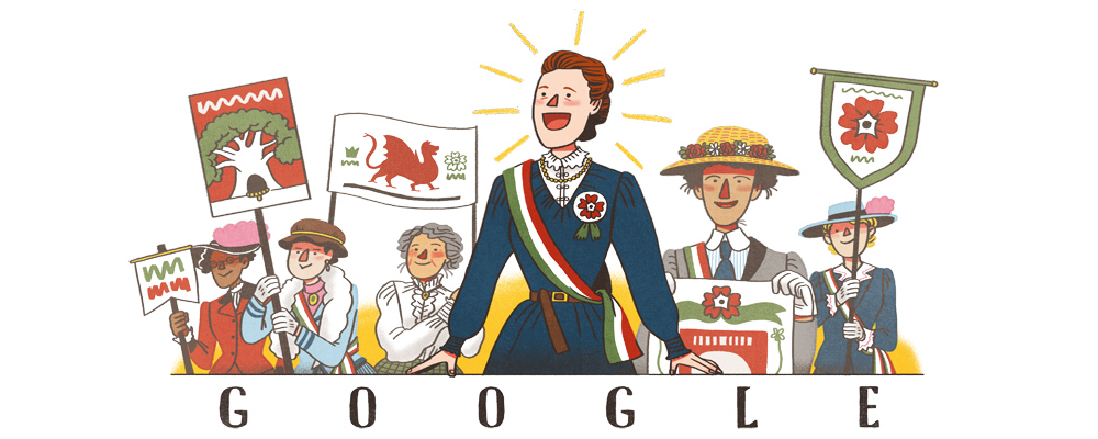
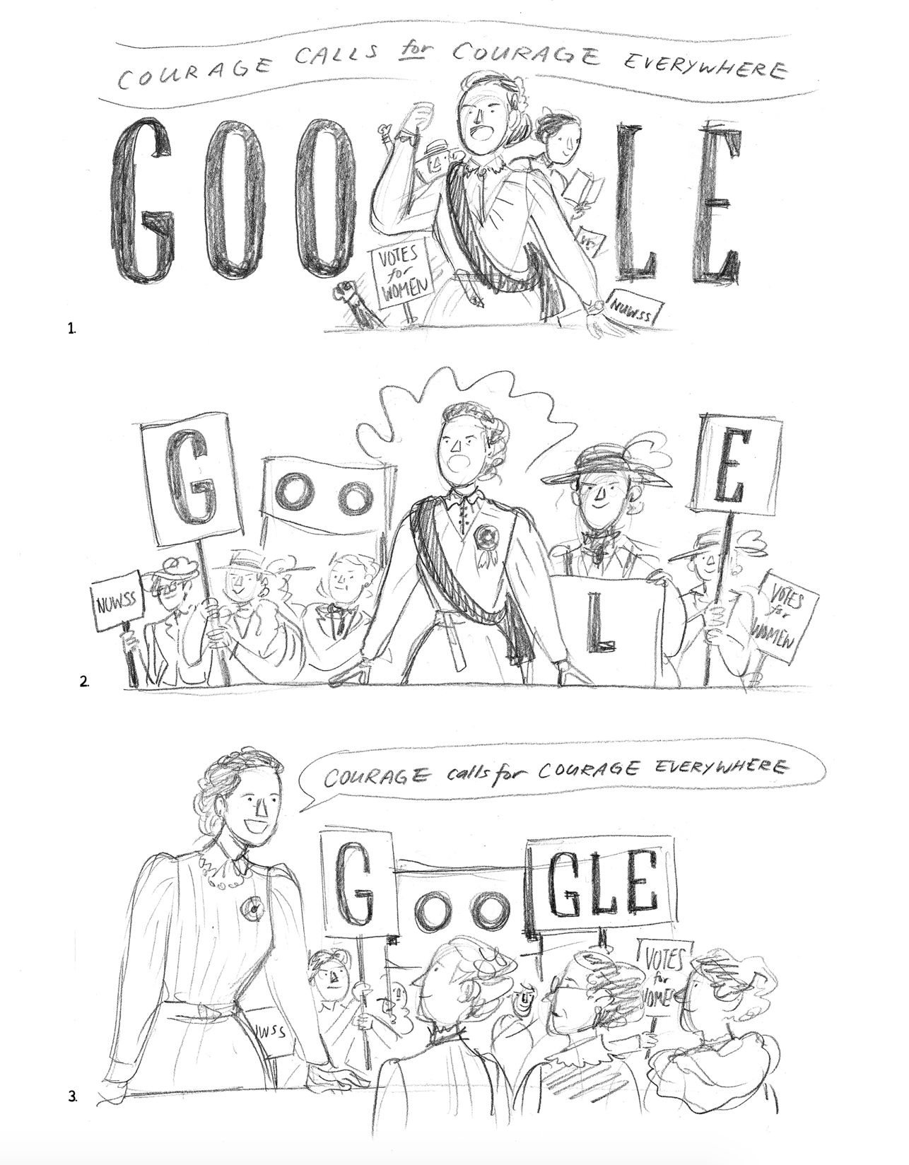
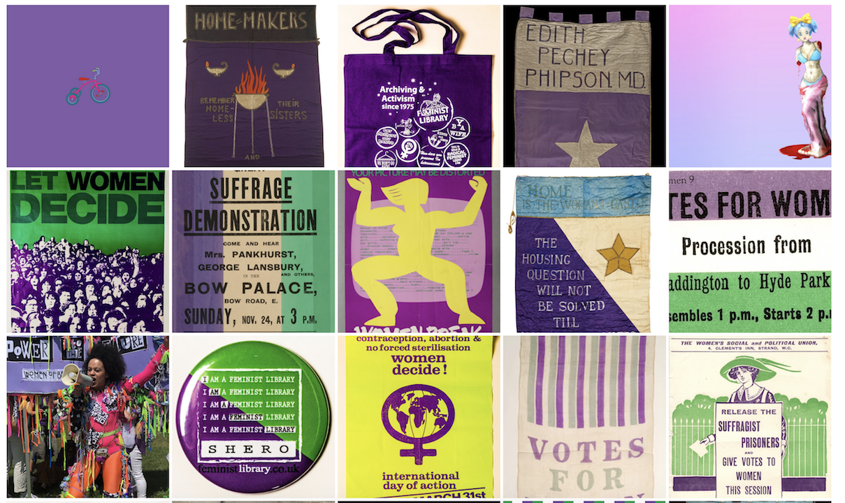
A Celebration to Feminism and Equality
illustrationCommentToday marks the 171th birthday to Dame Millicent Fawcett, a trail blazer feminist who championed relentlessly for equality and was a leading figure for the woman’s suffrage movement.
Aptly, today's Google Doodles celebrates such a great leading light in feminism, with illustrations on Millicent Fawcett drawn by London based illustrator Pearl Law.
In addition to these great illustrations to celebrate this leading lady, Google has setup a website that celebrates 100 Years to Women's Vote, with a webpage titled Road To Equality which is part of Google Arts & Culture.
In the webpage Road to Equality, you will find many enriching information from the history archives and stories of women that champion equality and feminist rights; from voting rights in the Suffragette movement up to including modern day issues such as period poverty.
This is an absolutely wonderful webpage celebrating feminism just like a curated museum online, filled with all the information, news articles and films footages. A must visit site.
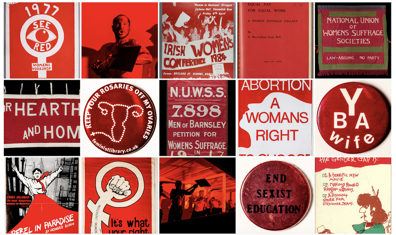
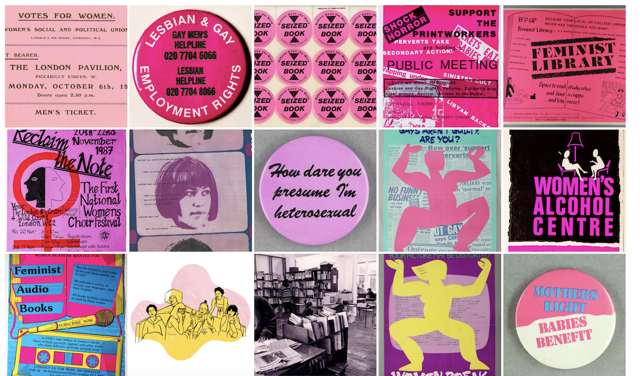
The website also includes many selected artwork, graphics and meaningful banners design that were used during the different movements across time, that provides great insight to the typography, graphics and branding used to design for the different movements.
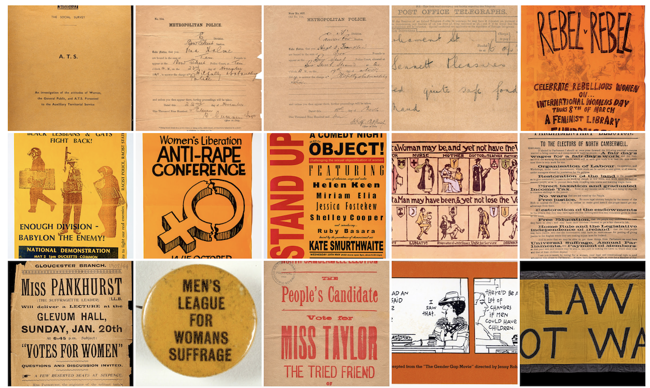
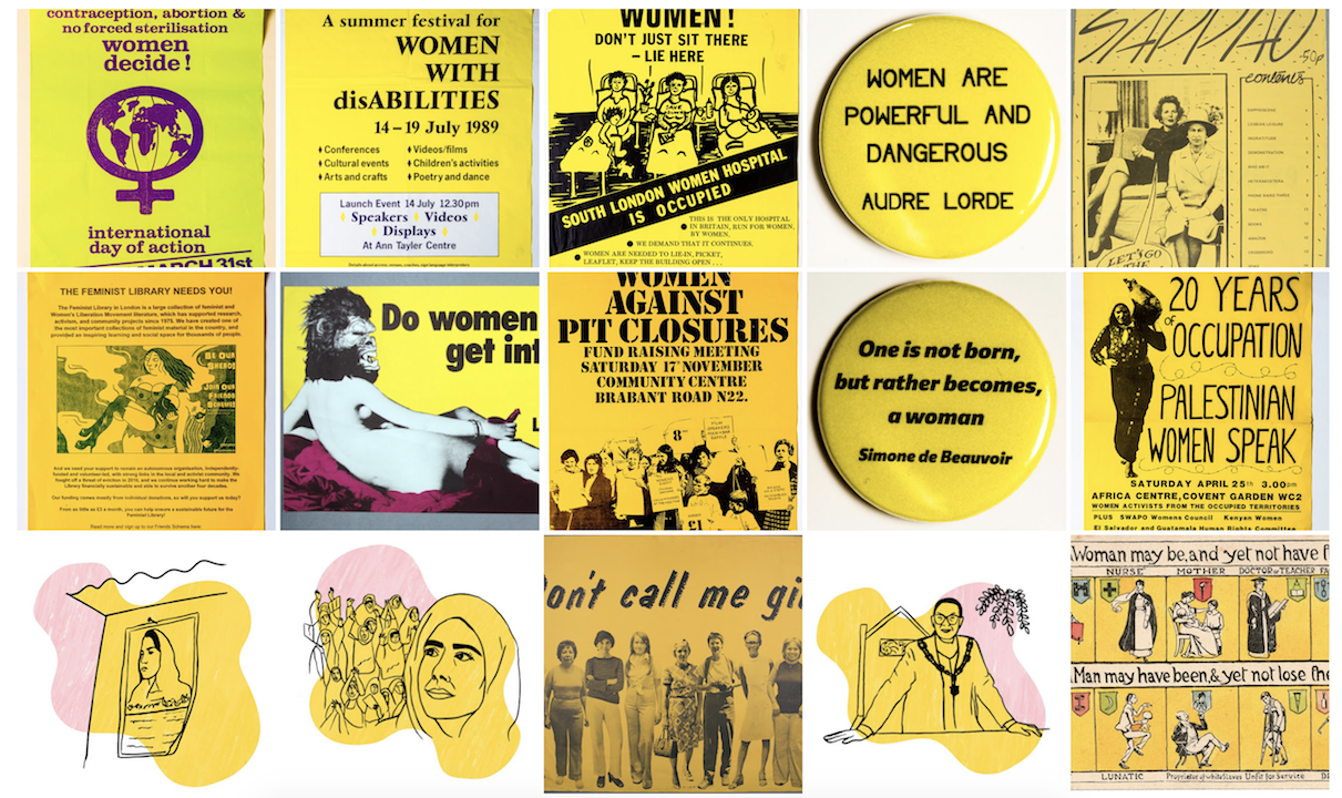
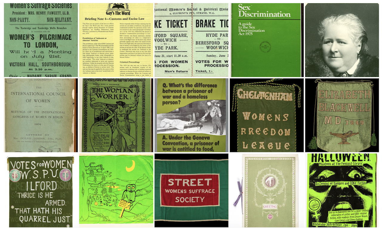
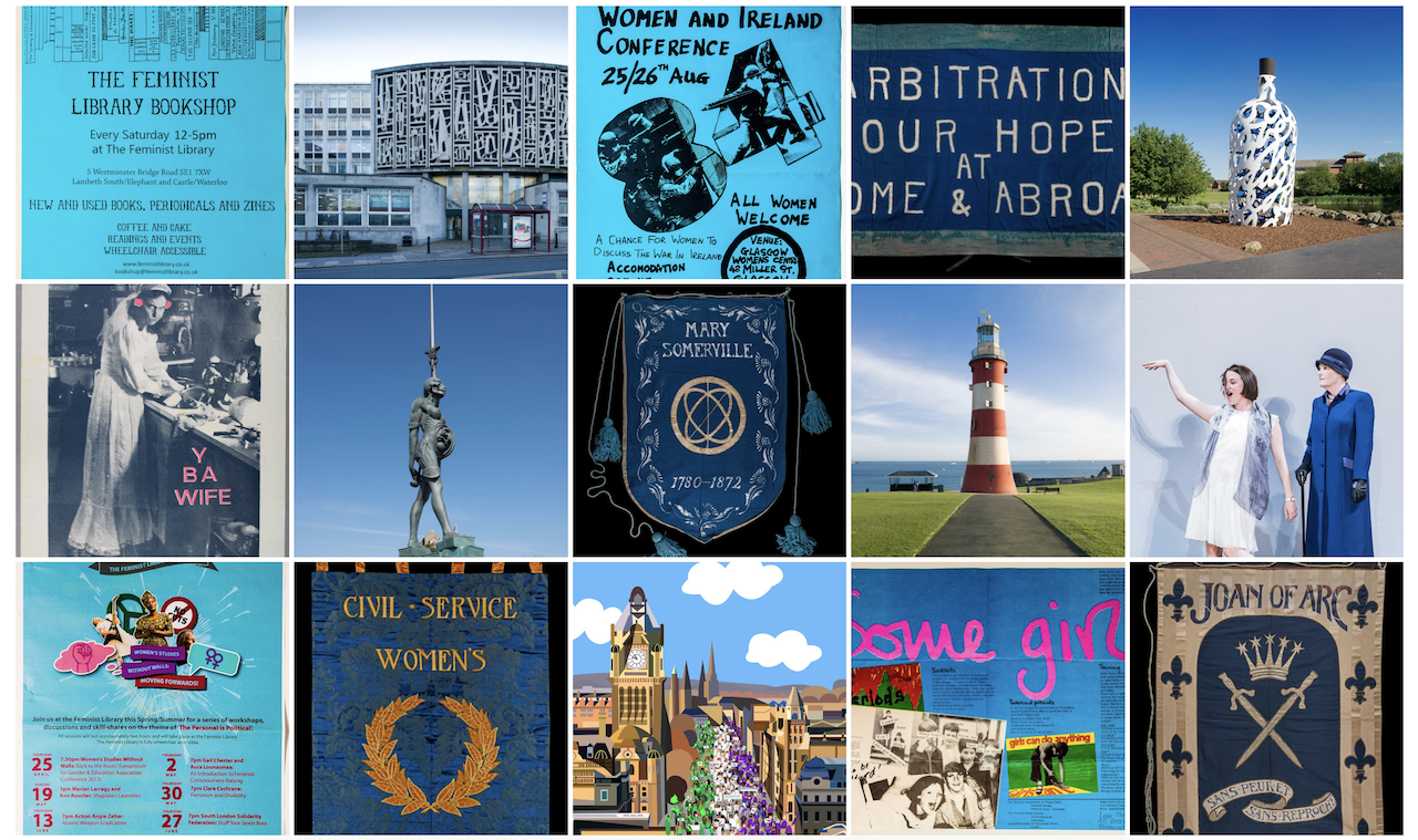
One section which particularly captures us is Google has set up a section called which defines the movement by colours. Via the "Colour Explorer" you can explore beyond the purple and green colours one would typically associate with the Suffragette movement, but the full rainbow spectrum of colours that were used in the graphics for various feminist movements.
We have included below a small carousel of snippets of the interesting plethora of images, categorised by colours, to take a page from history.
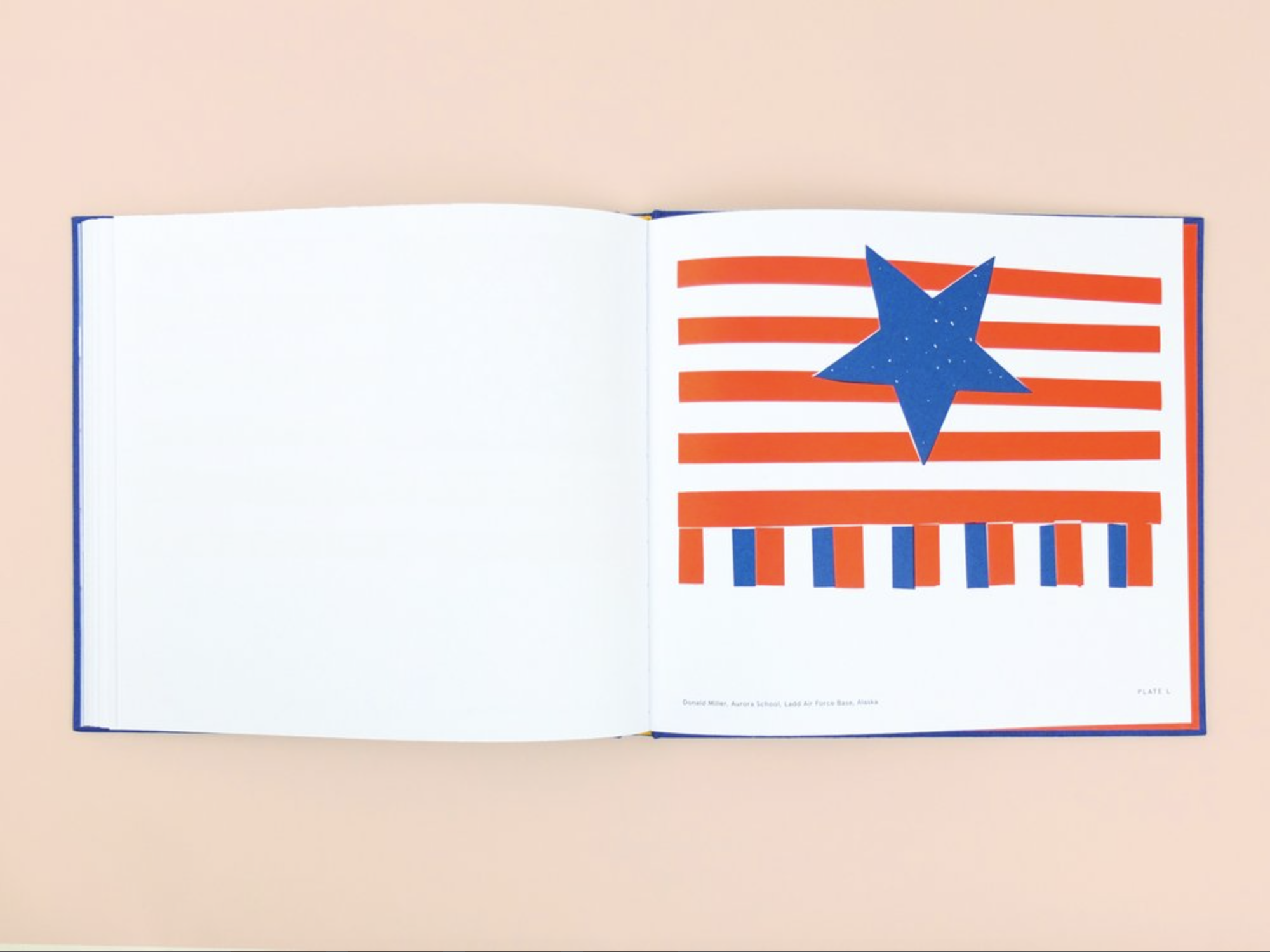
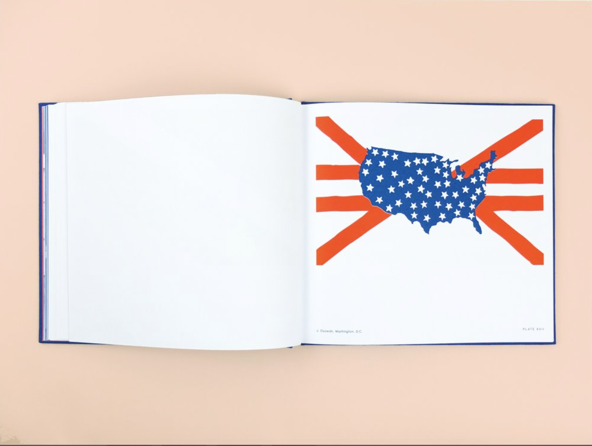
Alternate American Flags Designs
readCommentOld Glory, a limited edition linen bound book published by Atelier Éditions, Old Glory features 50 unseen United States flag designs that were submitted to President Eisenhower, following the addition of Hawaii & Alaska as the 49th and 50th states of the United States in 1958 and 1959.
Images courtesy of Atelier Éditions.


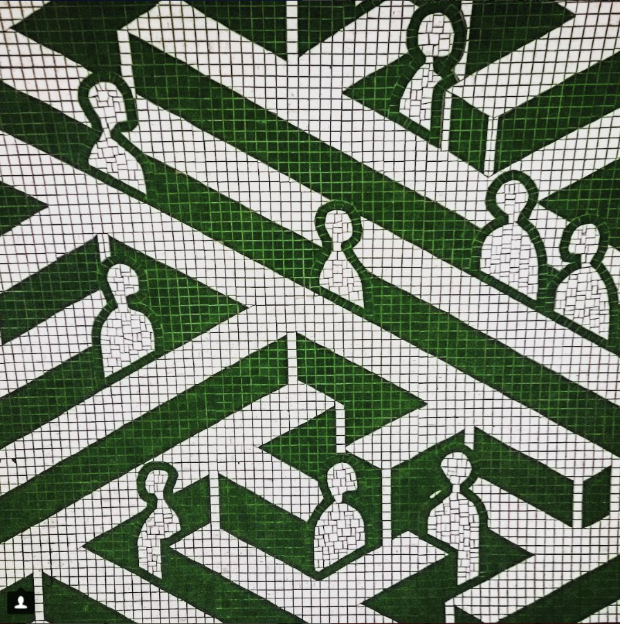
London Underground Patterns
designCommentWith our frequent commute on the London Underground, with the hustle and bustle we sometimes forget to take stock of the beautiful patterns and illustrations that could be found decorating the walls of the London tube stations. Thank you to instagram account Tube Patterns that have documented the graphical commute.
The below set of tile graphics include patterns from stations including Paddington, Tottenham Court Road, Euston Station, Highbury and Islington and Oxford Circus. Choo choo!


Stranger Things
font, geekery, funCommentLove Netflix and chill on Stranger Things? We love it too and also the font of Stranger Things. "STRANGIFY" (or "Make IT Stranger") a wicked online tool that allows you to diy your own Stranger Things font created by Nelson Cash. Hey stranger, let's Strangify!

"Hey Stranger" made by the "Make It Stranger" tool