You may have seen a post on our Instagram last month regarding our love of Mapology Guides. They are very useful, thought provoking colourful illustrated maps that one would work through the steps on the maps, and it would guide you through some of life's issues with the goal to live a more fulfilled life.
These cool, graphically illustrated maps include some essential life skills to business skills where we may all sometimes need a little help on - a perfect guide through some of life's journeys. The themes of the mapology guides include "What's Bugging You?" (something we have used and it's ace), "Let's Negotiate", "Make It Happen", "Make Better Decisions", etc, all useful dilemmas we'd face from time to time, regardless of professions and stage in life. A good aid to work and process through dilemmas in an organised practical step-by-step manner.

We were first introduced these amazing life maps whilst we were at Papersmiths, and the mapology guides were kindly recommended to us. Since then, we fell in love with the products and ethos behind Mapology Guides.
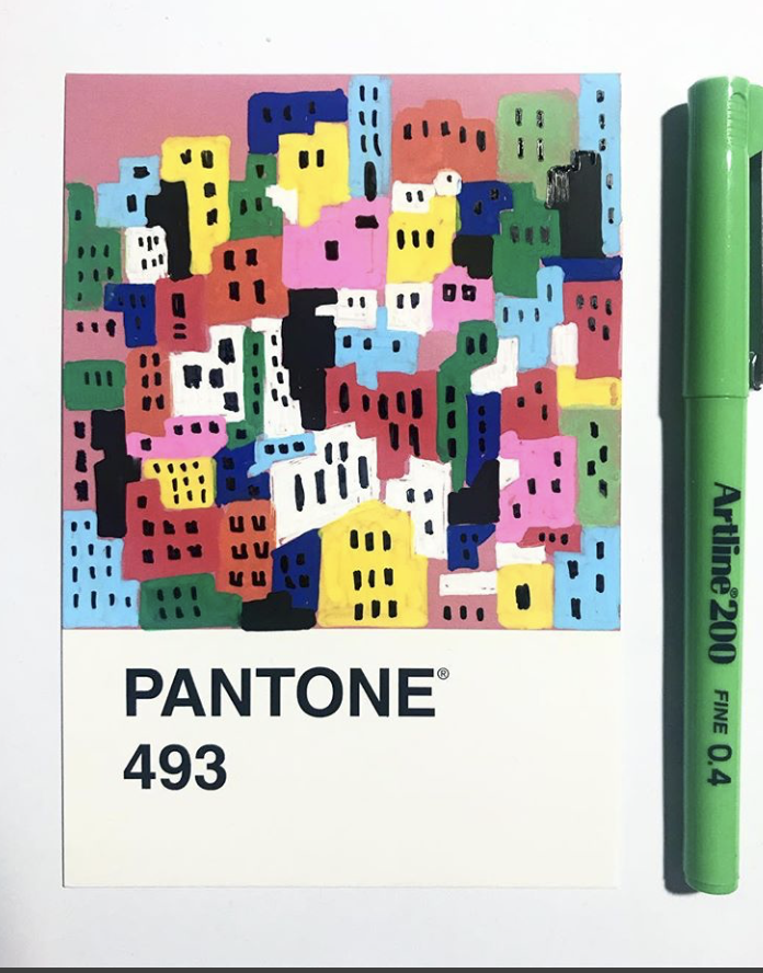
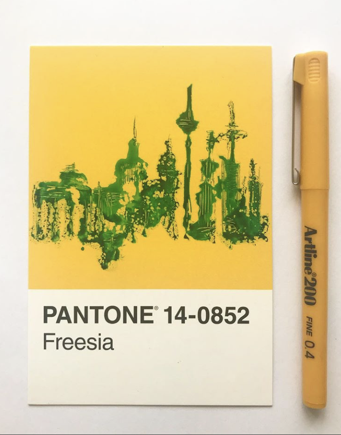
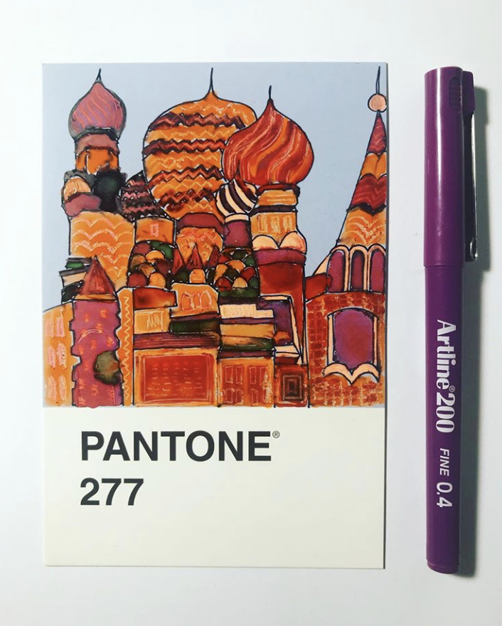
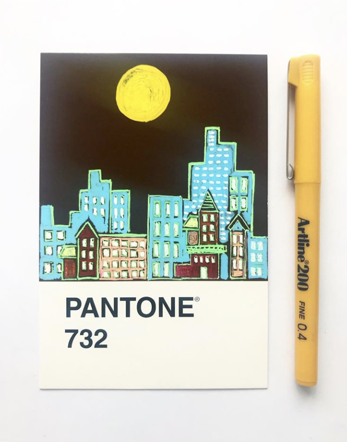
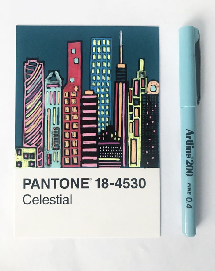
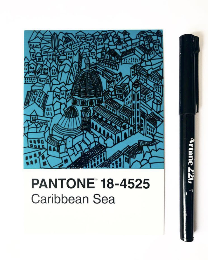
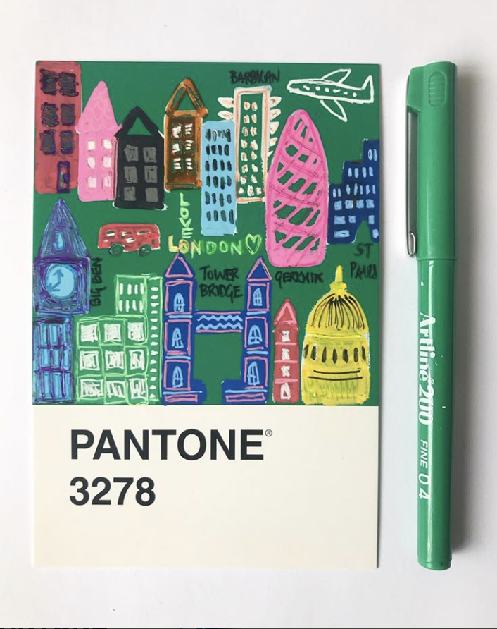
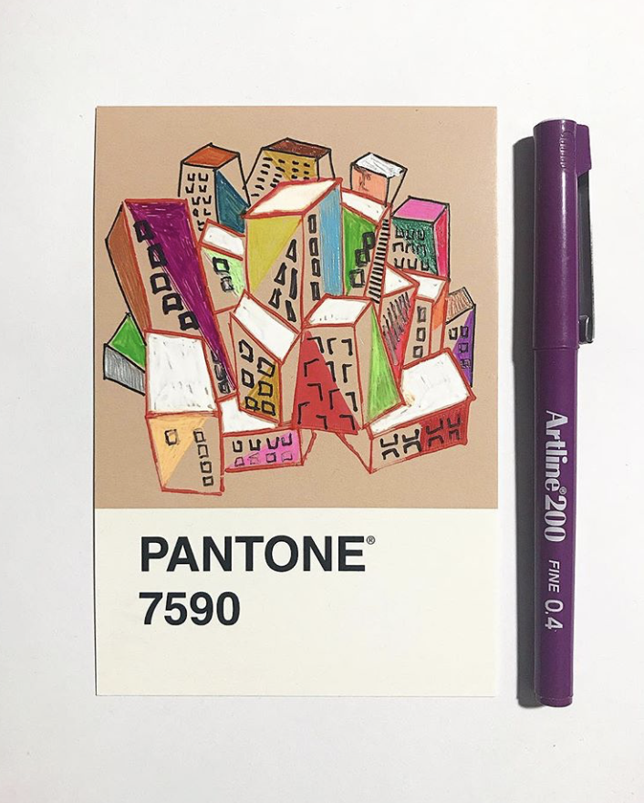
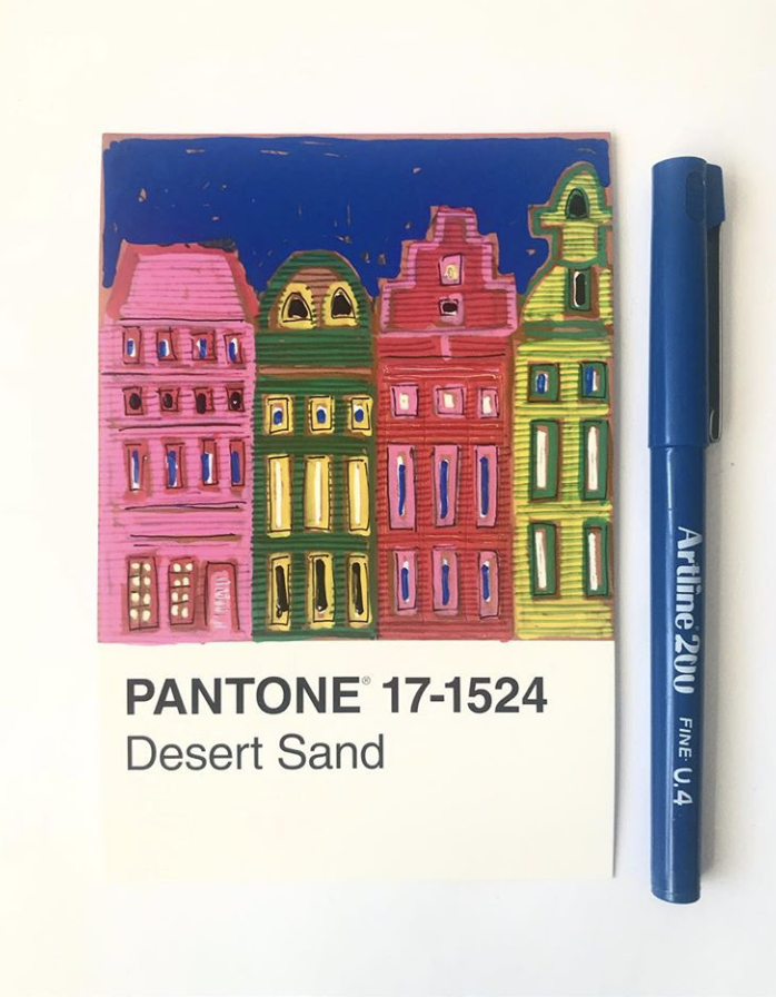
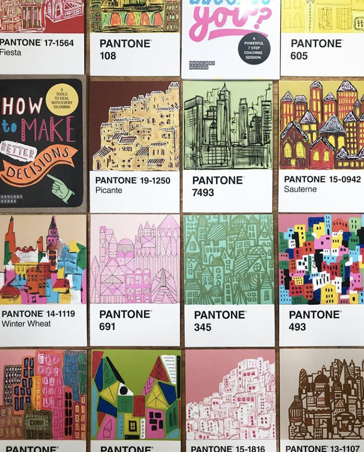
We follow Mapology Guides on Instagram, and found out, beyond creating brilliant useful life maps, they have embarked on a super fun project called "#100DaysPantonePostcards". Each post on the 100-Day project is photographed with an illustrated cityscape on a Pantone Colour Card, paired with an Artline pen.
As we are a fan of Mapology Guides, lovers of colour, traveling and Pantone, we had to approach Tina Bernstein, for a quick interview to learn more about such an amazing project and some tips on making goals happen.
I AM A : WHAT GAVE YOU THE INSPIRATION ON THE IDEA OF #100DAYSPANTONEPOSTCARDS WITH THE THEME OF CITYSCAPES?
Tina : I first participated in the #100daysproject back in 2016. I was naive and thought I can do this no probs. The theme I used then was #100differentstylesbycolourliving - the sketchbook I used was a fairly large square one and each day I chose a different artist and made an art piece in their style, whether painting, collage or mixed media. I also wrote a short sentence on each artist hoping I would inspire and maybe even introduce new artists to my followers.
Oh boy, it nearly killed me. Instead of the anticipated 30 minutes every day, some took HOURS!
I took a break in 2017. This year I wised up. The 100 pantone postcards are roughly a size A6 so very manageable. The colours would be my background and it all seemed fairly straight forward. It never is - but it was much more controllable than my project in 2016 because I was able to paint a few postcards at one time, freeing me up to not have to do it every single day.
Cityscapes are a big passion of mine. Yet, once again, one would think that’s great - BUT doing 100 cityscapes was rather challenging and I couldn’t wait to paint something else.
I AM A : OUT OF ALL THE CITY SKYLINES YOU HAVE ILLUSTRATED, WHICH SKYLINE HAS BEEN YOUR FAVOURITE?
Tina : Wow, difficult question. There are many I loved and some I’m not so happy with. There isn’t really a favourite one.
(We loved every single one of the cityscapes that were illustrated "#100DaysPantonePostcards".)
I AM A : OF ALL THE PANTONE COLOURS, WHICH ONE IS YOUR GO TO? IT'S HARD TO PICK ONE, YOU MAY PICK 3.
Tina : Again, as a colour aficionado, that’s a hard one. OK, three it is.
- Pantone 493 (a dark pink)
- Pantone 5405 (a dark turquoise)
- Pantone 1797 (a lovely red)
I AM A : APART FROM #100DAYSPANTONEPOSTCARDS YOU ARE ALSO THE FOUNDER OF MAPOLOGY GUIDES. AS CREATIVES, SOMETIMES WE ARE WORRIED OF NOT ABLE TO ACHIEVE THE GOALS WE HAVE SET OURSELVES. FROM DESIGNING THE GUIDES WHAT ARE YOUR TOP 3 ADVICES TO MAKE GOALS HAPPEN?
Tina : I apply this to everything I do. From a small project, to the #100daysproject to something like creating and launching Mapology Guides.
Step 1: Do you love what you want to create (whatever that may be). Without being 100% passionate about it, it might not happen. You’ll run out of juice.
Step 2: Break it down in manageable steps. That’s super important! Don’t look at the mountain ahead, look at the next step forward. Then build on that. Baby steps does it every single time.
Step 3. Get organised. It’s great to have the passion. It’s great to break it down into baby steps - now you need to get focused and prepare. Work hard. Once you think something is ready to launch, launch it. You’ll learn everything else from the feedback you will get.
I AM A : WHAT'S YOUR FAVOURITE QUOTE?
Tina : The unexamined life is not worth living
I AM A : WHICH IS YOUR FAVOURITE: RAINBOW / UNICORN / ICE-CREAM?
Tina : Rainbows - every time.
Thank you to Tina again for all your time for the interview, and sharing with us your insights on your 100-day project, and on Mapology Guides. Thank you for the pictures too. We love them!
Follow and check out Mapology Guides and their #100DayPantonePostcards on social media :
- Website : http://www.mapologyguides.com
- Instagram : @mapologyguides
- Twitter : @mapologyguides
- Facebook : https://www.facebook.com/MapologyGuides/
All images and text courtesy of Tina from Mapology Guides.